Music Meets Art Vol. 4
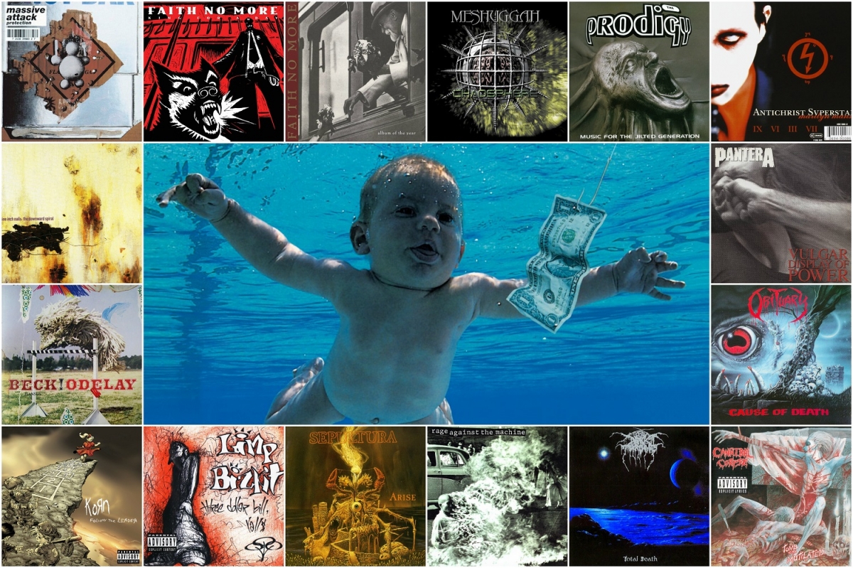
The most rapid and motley time in music came at the end of the twentieth century, and in the 1990s, a variety of styles and trends reached its apogee. Everything that could be mixed was mixed, and everything that could be synthesized was synthesized at that time. To many in our latitudes, cable TV came to the house and with it MTV. In the second half of the 90s, the Internet gradually began to spread.
Album covers became brighter. The process of release registration has become an integral part of it. There were already as many as three formats of different sizes: records, tapes, CDs. And, accordingly, the requirements for the layout and placement of the image became greater.
It is simply impossible to compile the TOP on album art and remain objective in this decade. Therefore, there is only a part that has become a classic and, in our opinion, has left its mark on history. These covers are still recognizable by completely different generations.
The Prodigy, of course, has become one of the symbols of the 1990s all over the world. They did not expect such popularity. The band forever left its mark in the history of electronic music, which at the same time may sound like live. Moreover, this is a group of four people, where only one is a musician. But, we are more about pictures, so let's take a look at the covers of The Prodigy "Experience" and "Music for the Jilted Generation".
The first is simply total and irreversible minimalism, behind which lies the real rave of the late 1980s - early 1990s. In the "Experience" not the visual part is important, but the sound inside, while its cover is associated with the electronic component of the decade and does not need any additional drawing.
With "Music for the Jilted Generation", the situation is different – the second LP of the band is decorated gloomily, with narcotic overtones and direct reference to the underground parties of that time. It's enough just to recall the clip for the song "No Good" from this album. A face, most likely breaking out from Keith Flint's web is on its cover. But where does it go and for what purpose?
In 2008, the authors of the techno-magazine Magazine Dataside compared the cover with the untranslatable term "persiflage", which means contempt for serious topics with a smirk. Narcotic and "dirty" motives were at their peak in those days. Suffice it to recall the movie "Trainspotting" or the video "Poison" from the same release of The Prodigy, where Keith Flint flounders in the mud
.
Another important breakthrough of that time was the cover of the Pantera "Vulgar Display of Power". The one on which some dude gets a fist in the face. This cover will be one of the symbols of the groove-metal pioneers in the metal world for many years. The design of the 1992 platinum album Pantera is still used as memes and inserts in comics and movies.
The cover image was taken by Brad Guice, a photographer who worked with the band during the release of "Cowboys From Hell". According to rumors, or rather from the words of Vinnie Paul, the drummer of the band, a certain Sean Cross was paid $10 and given a scoreboard 31 times to get a good shot for the cover. However, the photographer himself claims that no one ever hit the man during the shooting.
By the way, the name of the album was taken from the movie "The Exorcist". The phrase "coarse (vulgar) power" was first used there. The album went platinum twice. Also, the book "A Vulgar Display of Power: Courage and Carnage at the Alrosa Villa" was named after him. A book is dedicated to the tragic death of Dimebag Darrell, who was shot at a concert of the guitarist of the band. Many of the band’s song titles are used as chapter headings.
Along with the rise of groove metal in the 1990s, brutal death with the best-selling band in this direction Cannibal Corpse became very popular. The design of their albums cannot be ignored of course. It all started when Chris Barnes brought artist Vince Locke to the collective. It is the creator who is guilty of creating all the shocking images on the releases of the band. In addition to the covers, Locke is one of the authors of the Deadworld comic book series and co-authored A History of Violence, which was became a movie.
A good part of the scandalous design of Cannibal Corpse was created in that decade. You can take any for analysis – there will be no mistake. We decided to stop at "Tomb of the Mutilated". This work is interesting from a graphics and conceptual point of view. It is dedicated to necrophilia and sadism. The design depicts the brutal murder of a raped girl, and after the killing, the maniac continues his terrifying act.
Also, the song "Entrails Ripped from a Virgin's Cunt" is associated with a brutal story about two brothers, a girl that was stolen by them and a hanger, which can be read in English Wikipedia, but its confirmations are not found in official sources. There are funny moments in the episodes with this release – "Hammer Smashed Face" sounds in the first part of Ace Ventura.
During the rise of the death metal, the art of album decoration flourished and played with crazy palettes on almost every album of long-haired artists who respect their work. You can take any cover and there will be no mistake. A good example is Obituary and their 1990 "Cause of Death" album. There is no habitual for the dismemberment genre on the art itself, but there is carrion with skulls. As well as the nightly ominous sky with the traditional all-seeing eye for this approach.
The cover was painted by the artist Michael Whelan, who is also known for his works for Sepultura. But he is famous for drawing illustrations to fantasy and horror novels of famous authors. For example, the design of the "Dark Tower" by Stephen King is his work.
And the image from "Cause of Death" was used as an illustration to Howard F. Lovecraft's storybook "Lovecraft's Nightmare A". By the way, this art was originally planned to be used for the design of "Beneath the Remains" by Sepultura, but then it would not be included in the review of the 1990s since the album from the Brazilians was released a year earlier.
In all the heavy metal agony described above, Cavalera brothers occupy a special place. And after the incident connected with the cover of Obituary "Cause of Death", Michael Whelan suggested drawing the original design for the next album of the band. So white art album appeared to "Arise".
The album is the last in the era of thrash and death releases of the band. It is also known that Igor has long sharpened a tooth on the designer for giving the Obituary a cover. But at the same time, this incredible creation depicted on the face of the LP is now strongly associated with the first period in the work of the Brazilian heavy band.
But the epoch of MTV and multicultural raves has become famous not for a death metal only. That decade flourished and went on the rise industrial with its more mainstream and guitar components. The first places in this multifaceted direction took NII (Nine Inch Nails) and Marilyn Manson. One of the most significant albums of the genre is "The Downward Spiral" — a work by Trent Reznor from 1994. About this album of the "nails", probably, more than one dissertation has already been written, but this does not prevent us from talking about it today. Suffice it to recall the song "Closer", so that even an unknowing person would understand how important this release is.
Design of "The Downward Spiral" is also not so simple. The art of the album is fragments of a painting "Wound" by artist Russell Mills. In the original work, in addition to standard materials for fine art, the creator of the canvas used metal sheets that had undergone corrosion, wooden elements, as well as his own blood. The initial work in physical form is now on display at the school of the arts of the Scottish city of Glasgow.
It should be mentioned that by the time Halo 8 was released (the official numbering of the NII albums), CDs were already used as carriers, and then "complex" covers with booklets, inserts and various kinds of original designs appeared – from tabs and signs to special souvenirs or secret characters that you had to look for in the CD box.
Adrian Belew, one of the most underrated guitar players, took part in the recording of the album. He is known for his work with King Crimson and solo projects. Thanks to him, Trent Reznor later began to pay attention to live instruments and add their sound to releases.
In parallel with "The Downward Spiral" in the industrial genre, Marilyn Manson's "Antichrist Superstar" is worth noting, which came out two years later, in 1996. The album became one of the icons of shock-rock and is completely a conceptual piece. Since then there could be no talk of a simple design of the disc, "Antichrist" consists of a shuber (also known as a slipcase, a cardboard case for more reliable CD storage) and a jewel case.
On the front of the cardboard is a circle with four words Malice, Mind, Heart Complacent, and inside, on the box itself, Manson is depicted as the Antichrist with the numbers IX, VI, III and VII. Their meaning is likely to be simple trolling on the part of the performer, in order to be misleading or even more intriguing. The leader of the band is famous for its unconventional approach and views that fall out of the usual way of the average supporter of democracy and traditional religious values.
In addition, in the booklet to the album, you can read quotes from the Bible and study medical charts. Also, in the English glossy booklet, words of gratitude are written from Manson to the creator of the Church of Satan Anton LaVey and his book "Satan Speaks", which greatly influenced the shock rocker during his early work. The logos of the religious institution and the band of the period of the trilogy "Antichrist Superstar", "Omega and the Mechanical Animals" and "Holy Wood (In the Shadow of the Valley of Death)" are very similar in graphic and semantic execution.
You can also find direct references to the symbols of the SS, Boyd Rice, Aleister Crowley, the tetragrammaton and a host of other occult things in the design of the album. At the same time, Manson wanted to show the inconsistency of society with its many mutually exclusive standards.
No review of the 1990s can be done without Kurt Cobain, grunge, the anthem of the lost generation and the design of the album "Nevermind". According to Music Radar 2011, this art took second place among the covers of all times and people. We recall that it depicts a baby under water, which floats in the direction of the dollar bill, mounted on the bait.
A photograph for the front part of "Nevermind" was made by Robert Fisher, partly famous American painter and sculptor. There is a scandal associated with this cover over the image of a naked baby, who has a penis in the photo. The Puritans of the United States used to have a long try to ban the cover. Kurt and his companions did not agree to print the censorship version of the album, explaining that only latent pedophiles can offend such photos.
In general, the image on the album criticizes the consumer lifestyle, which was then gaining momentum in developed countries. Years later, the cover hero, no longer a three-month baby, named Spencer Elden, appeared in the same photo shoot in 2016, on the 25th anniversary of the release. Before that, he did the same in 2001, when "Nevermind" turned 10.
This is not the only appearance of the "model" on the art from musicians. In 2003, Elden appeared on the cover of "The Dragon Experience" — the solo album of the leader Skinny Puppy cEvin Key.
Another icon of the time that cannot be ignored is the 1996 Beck's "Odelay". This art is considered as one of the best in the world, and this despite the fact that there is nothing particularly outstanding in a dog jumping over the fence. Maybe just a rare Hungarian breed of dogs Komondor.
However, it is worth noting that the author of the collage for the release was Beck's grandfather, an American artist Al Hansen, who was also the father of Bibbe Hansen, the mother of the performer, who was one of Andy Warhol’s favorites in the 1960s. She is also known for recording an album with Jack Kerouac in the band The Whippets.
At the same time, the album has become not only a double platinum indicator of the era. Its design is absolutely recognizable by all music lovers. The name "Odelay" is a phonetic rework of the Spanish-Mexican slang "Orale" (accent on the first syllable), loosely translated as "listen" (hearing) or "what's up?".
There is a share of good irony in the release itself, subtle and with a smile, as Beck Hansen can do. Its design, in fact, is really not that outstanding, but, if we talk about the content ... probably because of him, the album is constantly put in all possible ratings, related to album art in particular.
One of the pioneers of mixing styles like funk, rap & heavy metal. Each album is a conceptual manifesto with specific goals. Caustic texts and catching riffs set the vector, raised the bar for an alternative scene of the 90s, which no one was able to overcome. RATM themselves tactfully and delicately disowned the nu-metal scenes of their era, saying that, of course, modern bands à la Limp Bizkit appreciate and respect, but carry other ideas into the world, having a different philosophical background behind them. If at all, this word can fully characterize the Rage Against The Machine with their ideological offensive under the red five-pointed star.
Their first album, identical with the name of the band, stirred minds, created a sensation, gathered stadiums, covered steppes, fields, megalopolises, tape recorders and sprayed the "ultra-left virus" in the capitalist world. But we have a music edition, and material about album art, so we’re telling: the cover of the first album of the band depicts a Buddhist monk Thich Quang Duc, who committed an act of self-immolation in the middle of Saigon in 1963. With this action, he protested against the persecution of Buddhism, which was then cultivated by the first president of Vietnam.
The photo of the burning monk was printed in numerous foreign publications and caused a crazy resonance around the world. Perhaps it was one of the first moments in the second half of the twentieth century when the West focused on the East. The author of the picture, Malcolm Brown, received the Pulitzer Prize for him. The monk was subsequently cremated, but this story has a striking fact. After the self-sacrifice by fire, the monk's heart remained whole and did not burn. In combination with the work of the first RATM album, their lyrics, the cover produces a cumulative effect. After the first track, there is already a feeling that somewhere there is a hotbed of resistance.
Korn & Co, which included Limp Bizkit, was a very symbolic company of the time. Nowadays people do not really like and respect this band. But then, in 1997–1998, their "Three Dollar Bill, Yall" became an insanely iconic record that influenced the minds of the nu-metal fans that were capable of analyzing.
The album itself is out of the general mood and style of the whole ensemble. The release is interesting because it is played raw, organic, lively and very tasty. Wes Borland (guitarist of the band) did not take seriously this work at that time. The sound of the record was strongly influenced by the band Tool, which is heard clearly in the mass of songs. And only on this album, the band allowed itself a fifteen-minute experimental improvisation "Everything".
What is the cover? And who of the fans of nu-metal and rap-core of that time did not try to copy the incomprehensible black figure on the left of the disk and repeat the font of the gang name? Later, none of the releases of the band will be decorated, recorded and made like this first and, perhaps, the only non-standard album of "lame biscuits".
The second outstanding work in album art from the alternative of that time was one of the main inventors of nu-metal — the band Korn and their 1998 LP "Follow the Leader". In principle, all their covers from that 10th anniversary can be safely put in the TOPs and charts. But this is perhaps the most interesting for a number of criteria.
First of all, that part of the plot with the children from the clip "Freak on a Leash", which was not included in the video, was drawn on the album design. Secondly, inside the booklet depicts a lot of nuances, for example, pictures with naked women, which can be overlooked with the naked eye. And, thirdly, the cover of the album was painted by Todd McFarlane, who painted modern comics about Spider-Man and became the parent of the whole series about Spawn. And this anti-hero vampire hunter thundered very hard in the 1990s.
It was Todd McFarlane who defined the whole style for comics, which is used now. This style can be called an adapted manga, as the artist painted large and vivid images in detail, while at the same time distributing panels for story lines on the page and retaining more American features in the characters themselves.
In that loud decade, it is difficult to leave anything without attention, because besides live music, electronic music developed at such a crazy pace that styles were invented at the speed of bullets from automatic weapons. English album art did not lag behind its neighbors. So many new masterpieces were born. And since Britain was then one of the centers of the club movement, we will not manage without a pair of electronic names of that time.
The British guys Underworld with their "dubnobasswithmyheadman" said a new word in the design of dance CDs. The band members with their friends artists created a kind of design association Tomato. This conglomeration is now based in three cities: London, Melbourne and Tokyo.
A multidirectional company runs various cross-platform projects focused on the commercial segment. And then, back in 1994, Tomato created a style of chaotic graphics, which became one of the models for the design of electronic music albums.
On the "dubnobasswithmyheadman" among the fonts and black and white graphic selection you can also see a palm print in the center of the plate.
Everyone tried to create some kind of union and sound system then. From one of these sound systems called The Wild Bunch, another electronic scene legend has grown up – Massive Attack. In the 1990s, they released everything that has now become a classic, and then instantly became a cult. Many have probably already read that behind the pseudonym of an anonymous writer and artist Banksy may be hiding Robert 3D del Maggio from the band.
And yes, really 3D from time immemorial draws pictures and does graphic works. He had a lot of exhibitions and has his own recognizable style. According to some reports, the landmark album "Protection" is decorated with one of his works. At the same time, official sources reported that the design of the release was engaged in the London studio Michael Nash Associates. But these are not mutually exclusive paragraphs.
A little about the work of psychos. The creators of mat-metal and the first of its kind Sweden band Meshuggah is also difficult to ignore in this material. In the 1990s, they released three albums, which became the basis of their work. Then not everyone understood what the music of these experimenters could lead to and where to turn it.
Brain, encased in a steel frame on the design of "Chaosphere", just perfectly illustrates what their music can do with the listener. This design was invented and brought to life by drummer Tomas Haake. According to Modern Drummer, he is the number one drummer in the world. In addition, he also performs vocals in the band.
Speaking about the psychos of that era, the first who comes to mind is Mike Patton, who has always been distinguished by his versatility and being a constant workaholic. At that decade, his most "even", at that time, the band Faith No More was just finishing its career. We will not go into the details of how much the band has influenced ... yes, everyone who loves the music of that time.
In the 1990s, the band decided to complete its activities and did it quite pathetically, releasing two albums with loud names "King for a Day ... Fool for a Lifetime" and "Album of the Year". The first release was illustrated by one of the artists of The New Yorker, who is known for his work with the movie about the American poet Allen Ginsberg "Howl".
The cover of the "Album of the Year" shows the first president of the Czechoslovak Republic, Tomas Masaryk, and inside the booklet of his funeral with the inscription on the coffin "Truth is above all", which is now the main motto of the Czech Republic. This release is explained by the fact that during the promo tour in support of the album, Faith No More very often performed in costumes.
The last, beyond the permitted, musicians in our review are two black-metal bands — Darkthrone with "Total Death" and Burzum with "Filosofem".
Darkthrone with its dark space cover and logo for the fourth decade has remained one of the classic symbols of the black metal direction. And if their music is not a model for imitation and admiration for every connoisseur of the genre, then the release design has become almost a benchmark for future generations of musicians playing in the appropriate style.
Things are approximately the same with Burzum, and even then Varg Vikernes had an internal "roof leaking", as it was hardly dripping on his head in a Norwegian prison. The album was written entirely by one person, and the names of all the songs in it are in German. And the release itself was the first in the genre of depressive black-metal because of a non-standard synthesizer on the background, the sound of which plunges into a state of deep despondency and foulness of being.
This is not the whole album art, which I would like to cover over a ten-year period, of course. But with each epoch, with each decade, there were more and more new releases, and each artist, designer, photographer and musician made their own special design, booklet, special box. In the 2000s, digital media began to appear in large quantities, and the vector of the graphic designation of music began to change once again, but this will be illustrated in the next material.
The material was read, supplemented/cut, commented by: Philip Dobrov, Valery and Yulia Kornevy, Olexander Masovets, Yaryna Denysyuk. Thank you so much!
To be continued…
The material was prepared with the support of:
RobustFellow Bandcamp Facebook VK Twitter
Ethereal Riffian Bandcamp Facebook VK
All the parts of the material are here:
https://www.neformat.com.ua/rubrika/music-meets-art
All images are copyrighted by their respective copyright owners.

